Latin American Architecture at the MoMA
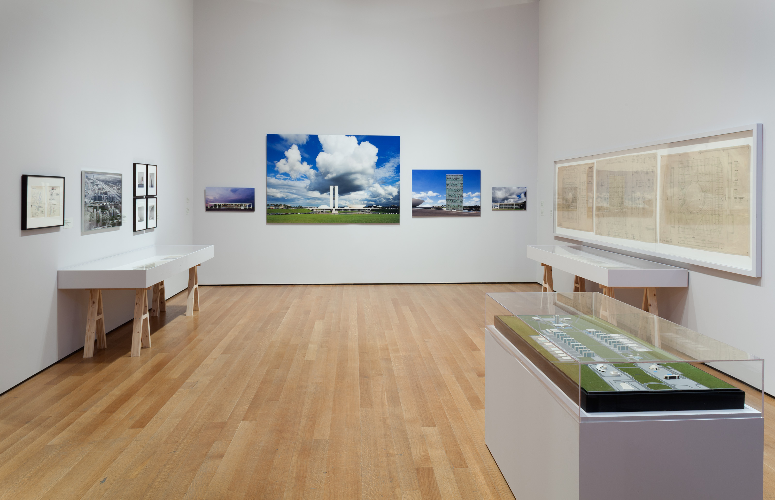
18 August, 2015This past July the Museum of Modern Art in New York City wrapped up its four month long exhibition, Latin America in Construction: Architecture 1955 – 1980; an exhibition that delved deep into the modern coming-of-age era of Latin American urbanism and architecture. Barry Burgdoll stated in the exhibition catalog that, “so dominant has the narrative been of Latin America as a testing site for the architectural and urban-planning ideas of Mies van der Rohe, José Luis Sert, and Le Corbusier (helped along by the Uruguayan, Colombian, Mexican, and Argentine architects who trained in the latter’s atelier) that the originality of many key Latin American projects is often obscured from historical view”. The exhibition sought to reveal the originality of these key projects, forcing to the limelight the narrative of Latin America’s modern progression not just in the architectural structures and buildings of the time, but in the ideology and aesthetic behind them and the widespread influence that proceeded them within a historical and regional context. To recreate this narrative of architecture and urban planning, the exhibition pulled from numerous sources to compile an impressive collection of models, original drafts, blueprints, site plans, photographs and films. Detail and attention were given to a variety of these key innovative and influential urban projects, buildings and complexes that have since become architectural icons and landmarks scattered throughout this region.
As I entered the first room of the exhibition on the sixth floor of the MoMA, seven large film screens hanging individually from the ceiling welcomed me as they projected the documentary, The Poetics of Development by Los Angeles based film-maker Joey Forsyte. Each of these screens retraced the steps of the seven major Latin American cities (Mexico City, Havana, Caracas, Rio de Janeiro, São Paulo, Montevideo and Buenos Aires) as they advanced in infrastructure, architecture and urban design during the first half of the twentieth century. Giving off the similar nostalgia of watching a vintage reel movie, these seven screens each assigned to a particular city, simultaneously displayed actual film footage and sound clips in a mosaic of images that reconstructed the development of these cities from 1900 to the 1950s. Pictures spoke louder than words, and before my eyes I watched in the looping eight-minute documentary as seven landscapes, beaches and urban centers transformed into booming metropolises and modern cities.
One of the most astounding urban projects and architectural achievements in Latin America during this time was the creation of Brasilia as the new Brazilian capital city, which the museum devoted an entire room for. As far back as colonial times, the idea conceived of moving the seat of government from Rio de Janeiro into the hinterland savanna of the Brazilian central plateau. However, it was not until the mid 1950s that the construction of the new capital was financed and prioritized. In 1956 the architect Oscar Niemeyer was appointed director of architecture and urbanism and subsequently announced a national competition to plan the city. Lucio Costa, already an established designer and architect within Rio’s Carioca school, won the competition and within the next three years the new city was completed and inaugurated in April of 1960.
The original city draft of Costa’s winning entry clearly depicted Costa’s vision for a quasi-symmetrical city built along two main arteries, or axes. The horizontal axes, spread out like the wings of a bird, encompassed the urban residential superblocks originally designed and planned to accommodate five hundred thousand inhabitants. The vertical axes, however, took on the iconic image of the monumental sector where Niemeyer would construct the main government buildings. Among the many reasons why this entry was chosen, Costa’s design stood apart from the majority of other entries that showed schemes of more conservative European influence, and supported Brazil’s drive for autonomy and individuality within urban planning. Also, because Costa had focused his plan around the mixture and unity of sustainable living within the city. The idea of the automobile was also at the center of his planning, an idea that was quickly infiltrating the minds of city planners throughout the world at this time. The central transportation hub and bus station was strategically located at the intersection of the two axes, centralizing the role of transportation in this new modern city.
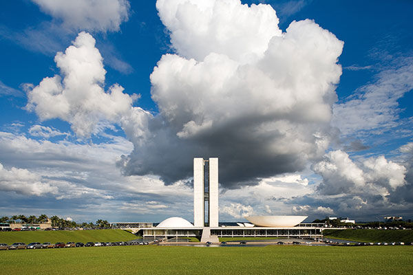
Lúcio Costa and Oscar Niemeyer. Plaza of the three powers, Brasilia, Brazil, 1958-1960. Photograph: Leonardo Finotti
The museum also displayed models and large photographs of Brasilia, especially focusing on Niemeyer’s government buildings, as well as a separate documentary that showed, through black and white vintage images and footage, the actual construction of the city’s infrastructure and buildings. The government buildings: Palácio da Alvorada, Esplandada dos Ministérios and the Praça dos Três Poderes with the Congresso Nacional, all designed by Oscar Niemeyer, have since adapted a distinct iconic image. Their stature is that of both prestige and controversy in the annals of modern architectural history. They are not only symbolic and monumental, but they also exemplify the light and airy idiom of Niemeyer’s architecture and are the apotheosis of the International Style influence in Latin America and the modernist individuality that elevated Brazil in the first half of the twentieth century. Probably the most recognizable is the Congresso Nacional at the Praça dos Três Poderes; twin towers of pure, clean lines and glass curtain walls that rise above the vast surrounding savanna flanked on either side by two monumental domes, one inverted, spread out over an open plaza. Considered a waste of emptiness by some, a controversy by others, and a masterpiece by many, Burgdoll recalls that the monumental sector embodies a simplicity and delicateness that has, “established the modernity of Brazil and the maturity of its urbanism on a world stage.”
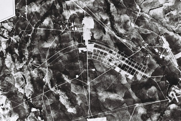
Brasilia under construction, 1957. Geofoto. Arquivo Publico do Distrito Federal
Similar to Brazil in the 1950s, Venezuela also experienced rapid growth in architecture and large-scale urban projects throughout its major cities, and nowhere was it more impressive and fast-paced than in Caracas. Surrounded by the omnipresent backdrop of the Cordillera de la Costa mountain chain, the buildings and urban restructuring took on a more dramatic telluric affect. By 1961 these new projects reached an unprecedented size with the construction of El Helicoide de la Roca Tarpeya. This large-scale project was designed by the collaboration of architects Dirk Bornhorst, Pedro Neuberger and Jorge Romero Gutierrez. Essentially this building comprised of a continuous coil of intertwining road, terrace and structure ascending up a small mountain peak. The architects envisioned a plan that consisted of a street that would spiral upward, with alternating ascending and descending levels, circling around a central domed structure. The function was to provide a radically new approach to the modern shopping mall as each ascending tier would consist of “drive-in” shopping. However, the final plans proved much more multi-faceted, including restaurants, clubs, a gymnasium, swimming pools and a luxury hotel. By occupying a lower peak of the Cordillera, the physicality of this large-scale mixed-use project restructured the actual landscape – creating a man-made mountain cap – and unified the mountains, architecture, roads and commerce under one roof. The architect Dirk Bornhorst recalls in his book concerning the El Helicoide that the entirety of the construction, “smoothly adapted to the rhythm of the surrounding hills, itself forming another rise within the urban topography.”
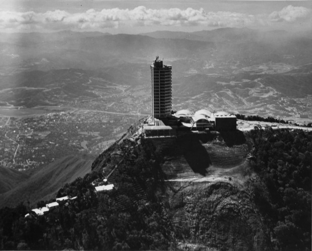
Tomás José Sanabria. Hotel Humboldt, Caracas, Venezuela, 1956. © Fundación Alberto Vollmer
Already entering the twentieth century with the salient prestige and acclaim of a successful economy and an alluring cultural capital city, by the middle of the century Argentina and Buenos Aires were competing with the rest of the continent for modern supremacy. Similar to São Paulo and Caracas at this time, the buildings being constructed in Buenos Aires were designed and planned on a grand scale, often penetrating entire city blocks. The Centro Cultural San Martin building, by architect Mario Roberto Álvarez and constructed in 1960, was an example of this grand scale construction, totaling more than 30,000 square meters. The Centro is a large multipurpose theater and cultural center, which occupied the entire city block between two major avenues in the heart of Buenos Aires. The MoMA displayed this complex wonderfully exhibiting a large cut-away model, which accurately detailed both the grandeur of the complex and many facets within the structure, such as two stage theaters and a cinema.
Another large-scale project, which also incorporated the government’s push to encourage foreign investments, was the Edificio Peugeot competition of 1961 to 1962. With the decision to erect a skyscraper that would surpass Mexico City’s Torre Latinoamericana – currently the tallest building south of the Rio Grande – the French Car manufacturer Peugeot and the Argentine Foreign Building and Investment Company opened an international completion that drew more than 200 entries from around the world. Although the tower was never build it became an international spectacle covered in publications and magazines in Europe and the United States and involved architects from more than fifty five countries – including the Bauhaus master-turned Harvard professor Marcel Breuer participating on the jury of the competition. The MoMA honored this competition with photographs of models and digital reproductions of the nine most prestigious entries.
Equally in line with the Argentine government’s vision was the headquarters for the Banco de Londres y América del Sur in Buenos Aires. The decision of this British based bank to locate its new headquarters in Buenos Aires, with branch banks dispersed throughout other Central and South American locations, attested to the stabilized and developed environment and precedent within Argentina at the end of the 1950s. Designed by Clorindo Testa and the SEPA Arquitectos studio, the bank headquarters is, according to Burgdoll, one of the architectural masterpieces of the period. The structure starkly contrasted with the surrounding neo-Baroque styled bank buildings that occupied the city blocks in the vicinity, and created a new radical environment for banking as a modernized urbane workspace. The large-scale cut-away model on display at the MoMA brought to light the contradicting simplicity and detail of the façade, as well as the materials, prefabrication and interior of the building. The exterior of the structure is a magnificent mixture of International Style and the new Brutalist Style as the delicate and transparent skin of glass curtain walls are supported by exterior sold concrete members that bellowed out above the sidewalks. These bellowing exterior elements created the effect that the building was expanding in mid-air, above the sidewalks, to occupy the maximum space within the city block.
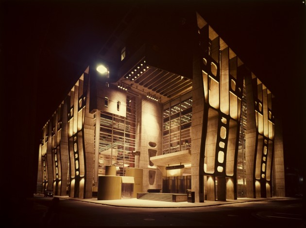
Clorindo Testa. Bank of London and South America, Buenos Aires, Argentina, 1959-1966. © Archivo Manuel Gomez Piñeiro, Courtesy of Fabio Grementieri
The push for international investments and recognition was not only isolated to Argentina. In 1960 the Chilean architect Emilio Duhart won the prestigious commission from the United Nations to build a new complex for its agencies in South America: the Comisión Económica para América Latina (CEPAL). In 1966 the completed CEPAL building, staged against the background of the Andes, was inaugurated and handed over to the agency. Burgdoll stated that Duhart won this competition with a design specific to the “majestic site and in dialogue with the powerful Andean topography.” This recurring South American theme of a powerful integration between building and mountains could be experienced fully in the pristine photographs and site plans on display at the MoMA. The CEPAL building also continued the recurring dialogue of monumentality and symbolism first established by the UN in their New York headquarters in 1949 followed by the UNESCO building in Paris in 1953. Although differing in scale and context than its two predecessors, the CEPAL building, according to architect and professor Fernando Pérez Oyarzún, posses a, “powerful design and technological advancements that make it the height of mid-century Chilean Architecture.”
Aside from its international relevance and powerful monumentality, the CEPAL building also demonstrated Duhart’s own mastery of trade. Like many South American architects, Duhart worked in Le Corbusier’s Parisian atelier and was involved in the urban planning and building design for Chandigarh, India. The lessons he learned during this time transferred over and can be seen in the way he controls the affects of sunlight throughout the building and throughout the different seasons. The influence of his European master is also revealed in the building’s visual aesthetic as the conical form of the assembly hall rises above the rectangular roofline – a sight similar to many of Le Corbusier’s own buildings. He also improved on some of the functional and design problems learned from the previous two UN buildings, namely the integration of the different workspaces between that of daily activity and occasional assembly. Duhart was able to create a flowing interconnected whole throughout his horizontally schemed composition by allocating the daily offices on a single elevated floor as they surrounded two central structures designated for assembly and events. In the end, Burgdoll explained Duhart’s solutions as a “complex composition held tightly in architectonic form.”
Already having a passionate interest for modern architecture, both in Europe and Latin America, and having previously visited a number of the actual buildings that were on display at the MoMA, the exhibition nonetheless provided an immensely informational and exhaustive overview of this exciting period in Latin American history. Although I have only discussed some of the major highlights, the exhibition displayed a vast variety of urban projects and buildings that have contributed to this modern narrative throughout Latin America. I found myself revisiting several sections and eventually cycling through the exhibition as a whole before forcing myself to eventually exit. The question for now is what could be next? Not only in the narrative of Latin American modernism that I have been discussing, but also in the relationship with the MoMA as the narrator. Architecture and design south of the Rio Grande has only continued to prosper since the exhibition title’s ending date of 1980. Now, well into the twenty first century, a growing number of architects, designers, firms and universities have continued to keep Latin America on the world stage in terms of their buildings, infrastructures and urban designs. New cities have emerged as new frontrunners in the narrative; Panama City, Florianopolis and Medellín often fill the headlines in today’s architectural and design publications. With contemporary architecture taking many different turns in design, technology and materials, it seems only inevitable to anticipate a future MoMA exhibition of Latin American architecture since 1980.
Follow Sounds and Colours: Facebook / Twitter / Instagram / Mixcloud / Soundcloud / Bandcamp
Subscribe to the Sounds and Colours Newsletter for regular updates, news and competitions bringing the best of Latin American culture direct to your Inbox.

